
The Secret Weapon Powering Top Tech Companies
Design Systems are vital for tech companies, ensuring consistency, efficiency, and scalability in product development. Essential for any growing tech business.
What is a Design System?
A design system is a comprehensive collection of reusable components, patterns, and guidelines that govern the design and development of digital products. It serves as a single source of truth for an organization's design language, ensuring consistency and coherence across all user interfaces.
The primary purpose of a design system is to streamline the design and development process, enabling teams to create high-quality, cohesive experiences efficiently. By providing a shared vocabulary and set of standards, design systems eliminate the need to reinvent the wheel for every new project, reducing redundant work and fostering collaboration between designers and developers.
Design systems typically include a library of reusable UI components, such as buttons, forms, typography, and color palettes, as well as guidelines for their proper usage. They also often encompass design principles, interaction patterns, and best practices for accessibility, usability, and brand consistency.
Some well-known examples of design systems include Google's Material Design, Apple's Human Interface Guidelines, IBM's Carbon Design System, and Salesforce's Lightning Design System. These systems have become industry standards, providing a consistent and cohesive user experience across a wide range of products and platforms.
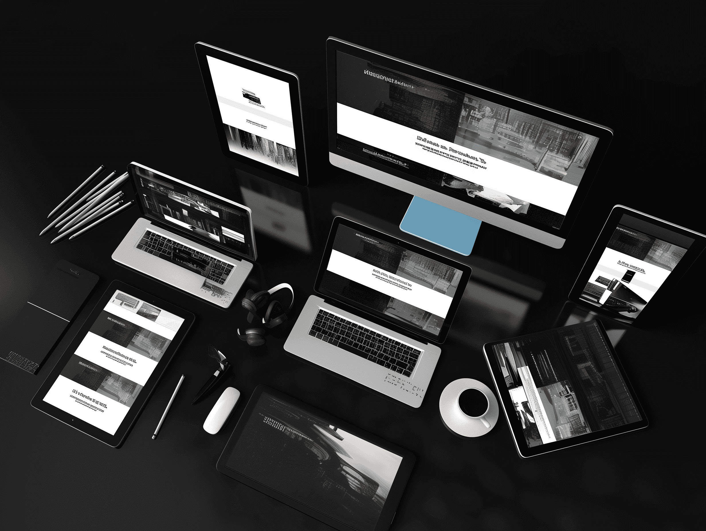
Get our Web - Responsive Design System or our Mobile Design System
The Importance of Consistency
Consistency is a fundamental principle in design systems and a key driver for their adoption across tech companies. It ensures a cohesive and seamless experience for users as they navigate through different products, platforms, and channels within an organization's ecosystem.
Consistency in user experience is crucial for creating intuitive and user-friendly interfaces. When design elements, interactions, and patterns are consistent across products, users can easily transfer their knowledge and familiarity from one product to another. This reduces the cognitive load and learning curve, leading to improved usability and user satisfaction.
Moreover, consistency plays a vital role in reinforcing brand identity. A unified visual language and design language across all touchpoints strengthens brand recognition and builds trust with users. Consistent branding ensures that users can easily identify and associate the company's products and services, fostering brand loyalty and recognition.
From a development perspective, design systems promote efficiency and productivity. By establishing a centralized library of reusable components and design guidelines, developers can quickly implement and iterate on designs, reducing redundant work and ensuring consistency across the codebase. This streamlined approach not only accelerates development cycles but also minimizes the risk of introducing inconsistencies or bugs during the implementation phase.
Overall, consistency is a cornerstone of design systems, enabling tech companies to deliver seamless and cohesive user experiences, reinforce their brand identity, and foster efficient and scalable development practices.
Design Systems at Tech Companies
Tech companies invest heavily in design systems because they provide numerous benefits that directly impact the user experience, development efficiency, and overall brand consistency. With design systems, tech giants like Apple, Google, Microsoft, and Amazon can ensure a cohesive and seamless experience across their vast array of products and services.
One of the most well-known design systems is Apple's Human Interface Guidelines, which has been instrumental in maintaining a consistent look and feel across all Apple devices and software. This design system not only defines the visual elements but also provides guidelines for interaction patterns, accessibility, and user experience best practices.
Google's Material Design is another prominent example of a design system that has been widely adopted across the tech industry. It offers a comprehensive set of guidelines, components, and tools for creating visually appealing and user-friendly interfaces. Material Design has become a de facto standard for many Android apps and web applications, ensuring a consistent experience for users across different platforms and devices.
Microsoft's Fluent Design System is another example of a tech company's commitment to design systems. It provides a unified design language and set of tools for creating modern, accessible, and inclusive experiences across Microsoft's products and services, including Windows, Office, and Xbox.
Amazon's Design System, known as the Amazon Design System, is a comprehensive resource that ensures consistency and scalability across Amazon's vast array of products and services. It includes guidelines, components, and tools for building user interfaces that align with Amazon's brand and design principles.
By investing in design systems, tech companies can streamline their design and development processes, reduce redundant work, and ensure a consistent and high-quality user experience across their products. Design systems also facilitate collaboration between designers and developers, as they provide a shared language and set of reusable components, reducing the need for constant communication and rework.
Moreover, design systems help tech companies maintain brand consistency and recognition, which is crucial in a highly competitive market. A cohesive and recognizable design language across all touchpoints can strengthen brand loyalty and trust among users.
Building a Design System
Creating a robust design system is a collaborative effort that requires input and alignment from various stakeholders, including designers, developers, product managers, and leadership. Here are some key steps involved in building a design system:
1. Define Design Principles and Guidelines
Establish a set of design principles that align with your company's brand, values, and user experience goals. These principles will serve as the foundation for your design system, guiding the creation of consistent and cohesive designs across your product offerings.
2. Conduct an Audit and Inventory
Perform a comprehensive audit of your existing design elements, such as colors, typography, icons, and components. This inventory will help you identify patterns, inconsistencies, and areas for improvement, as well as serve as a starting point for your design system.
3. Establish a Component Library
Create a library of reusable UI components that adhere to your design principles and guidelines. These components should be thoroughly documented, with clear guidelines for their usage, accessibility considerations, and responsive behavior.
4. Implement a Design Tokens System
Design tokens are the building blocks of your design system, representing values like colors, typography styles, spacing, and other design properties. Implementing a design tokens system ensures consistency and maintainability across your product experiences.
5. Collaborate with Engineering Teams
Foster a close collaboration between design and engineering teams to ensure seamless integration of the design system into the development process. This collaboration should involve regular communication, code reviews, and shared ownership of the design system.
6. Establish a Governance Model
Define a clear governance model that outlines the roles, responsibilities, and processes for maintaining and evolving the design system over time. This model should include guidelines for contributing to the system, reviewing and approving changes, and communicating updates to stakeholders.
7. Provide Tools and Resources
Equip your teams with the necessary tools and resources to effectively work with the design system. This may include design tools (e.g., Figma, Sketch), code libraries or frameworks, documentation, and training materials.
8. Foster Adoption and Evangelism
Encourage adoption and evangelism of the design system across your organization. Provide training sessions, workshops, and ongoing support to help teams understand the value and benefits of using the design system consistently.
9. Continuously Improve and Evolve
Treat your design system as a living, evolving entity. Regularly review and iterate on the system based on user feedback, new design trends, and emerging technologies. Establish processes for proposing, evaluating, and implementing changes to the system.
Building a design system is an ongoing process that requires dedication, collaboration, and a commitment to continuous improvement. By following these steps and involving stakeholders from various disciplines, you can create a robust design system that promotes consistency, efficiency, and a seamless user experience across your product offerings.
Components of a Design System
A well-structured design system typically comprises several key components that work together to establish a cohesive and scalable design language. These components include:
UI Components: At the core of a design system are reusable UI components or patterns that serve as the building blocks for creating user interfaces. These components can range from basic elements like buttons, inputs, and typography styles to more complex components like navigation menus, modals, and data visualizations. Consistent implementation of these components across products ensures a unified user experience.
Design Tokens: Design tokens are the low-level values that define the visual properties of UI components, such as colors, typography styles, spacing, and more. By centralizing these values as design tokens, teams can ensure consistency across all products and platforms, while also enabling easy maintenance and updates.
Guidelines: Design systems often include comprehensive guidelines that outline best practices, principles, and rules for using the system's components and tokens. These guidelines cover topics such as accessibility, responsive design, content strategy, and more, ensuring that designers and developers have a shared understanding of how to apply the system effectively.
Documentation: Comprehensive documentation is crucial for the adoption and maintenance of a design system. This documentation should provide detailed information on the available components, tokens, and guidelines, as well as code examples, usage scenarios, and implementation instructions. Well-documented design systems facilitate onboarding, collaboration, and consistent application across teams.
Tooling: Design systems often incorporate tooling to streamline the development and integration process. This can include code libraries or frameworks for implementing components, design token management tools, automated testing frameworks, and other tools that support the efficient use and maintenance of the design system.
By combining these components, a design system provides a cohesive and scalable approach to design and development, ensuring consistency, efficiency, and a unified user experience across products and platforms.
Scaling Design Systems
As companies grow and design systems mature, scaling them becomes a critical challenge. Ensuring consistent application of the design system across multiple teams, projects, and platforms requires a well-defined governance structure and robust versioning strategies.
One of the primary challenges in scaling design systems is maintaining consistency and adherence across different teams and products. Design systems often start as a centralized effort, but as adoption increases, it becomes harder to enforce guidelines and prevent fragmentation. Establishing a clear governance model with defined roles, responsibilities, and decision-making processes is crucial for maintaining coherence and alignment.
Version control and release management are also essential aspects of scaling design systems. As the system evolves, tracking changes, managing dependencies, and ensuring backward compatibility become increasingly complex. Implementing a robust versioning strategy, with clear guidelines for major, minor, and patch releases, helps mitigate risks and ensures a smooth transition for teams adopting updates.
Encouraging widespread adoption is another key factor in scaling design systems. Effective communication, training, and documentation are vital for onboarding new teams and promoting the benefits of the design system. Adoption strategies may include showcasing success stories, providing hands-on workshops, and integrating the design system into the development workflow through automated tools and processes.
Furthermore, scalable design systems often require a modular and extensible architecture. Allowing for customization and flexibility while maintaining a consistent core can facilitate adoption across diverse product lines and teams with varying needs. This can be achieved through techniques such as component composition, theming, and design tokens.
Design System Maturity
Design systems evolve over time, and their maturity level can greatly impact their effectiveness and adoption within an organization. As teams utilize and contribute to the system, it undergoes various stages of growth and refinement. Understanding these stages can help teams assess their current state and plan for continuous improvement.
There are generally three stages of design system maturity:
1. Foundational: At this stage, the design system establishes a basic set of components, guidelines, and principles. The focus is on creating a solid foundation and ensuring consistency across products or projects. Teams may encounter challenges in adoption and maintenance during this initial phase.
2. Scaling: As the design system gains traction, teams begin to scale it across multiple products or teams. This stage involves refining existing components, adding new ones, and ensuring the system remains consistent and efficient. Governance and documentation become crucial to support widespread adoption.
3. Optimization: In the optimization stage, the design system is well-established and widely adopted. Teams shift their focus to continuous improvement, performance optimization, and addressing emerging design and technology trends. Metrics and feedback loops play a vital role in identifying areas for enhancement.
To measure the success and maturity of a design system, teams can track various metrics, such as:
- Adoption Rate: The percentage of products or teams using the design system, indicating its reach and impact within the organization.
- Contribution Rate: The frequency and volume of contributions from different teams, reflecting the system's collaborative nature and engagement.
- Consistency Score: A measure of how consistently the design system is applied across products, ensuring a cohesive user experience.
- Performance Metrics: Indicators of the design system's performance, such as load times, bundle sizes, and rendering efficiency.
- User Feedback: Qualitative feedback from designers, developers, and end-users, providing insights into pain points and areas for improvement.
Continuous improvement is essential for maintaining a mature and effective design system. Teams should establish regular review cycles, gather feedback from stakeholders, and prioritize enhancements based on business goals and user needs. Design systems are living entities that evolve with changing technologies, design trends, and organizational requirements.
Design Systems and Accessibility
Accessibility is a crucial aspect of design that ensures products and services are usable by people with disabilities. In the context of design systems, accessibility plays a vital role in creating inclusive experiences across all digital touchpoints. A well-designed design system can significantly enhance accessibility by providing consistent and accessible components, guidelines, and best practices.
One of the primary benefits of design systems for accessibility is the establishment of standardized accessible patterns. By defining accessible components, such as buttons, forms, and navigation elements, design systems ensure that these elements meet accessibility requirements from the outset. This consistency not only improves the user experience for individuals with disabilities but also reduces the effort required to implement accessible features across different products or projects.
Design systems often include accessibility guidelines and documentation that educate designers and developers on best practices for creating accessible experiences. These guidelines cover various aspects of accessibility, such as color contrast ratios, keyboard navigation, screen reader compatibility, and adherence to Web Content Accessibility Guidelines (WCAG) standards. By providing clear and comprehensive accessibility guidelines, design systems empower teams to make informed decisions and prioritize accessibility throughout the design and development processes.
Furthermore, design systems can facilitate the implementation of automated accessibility testing and monitoring. By incorporating accessibility testing tools and processes into the design system's workflow, teams can catch and resolve accessibility issues early, reducing the need for costly rework and ensuring a more inclusive user experience from the start.
Effective design systems also promote the concept of inclusive design, which goes beyond meeting minimum accessibility requirements. Inclusive design principles encourage designers and developers to consider the diverse needs and preferences of all users, including those with permanent, temporary, or situational disabilities. By embedding inclusive design practices into the design system's philosophy and guidelines, teams can create experiences that are not only accessible but also intuitive and delightful for everyone.
In summary, design systems play a crucial role in promoting accessibility by providing consistent accessible components, guidelines, and best practices. They empower teams to create inclusive experiences across all digital touchpoints, ensuring that products and services are usable and enjoyable for people with disabilities. By prioritizing accessibility within design systems, organizations can demonstrate their commitment to inclusivity and enhance the overall user experience for all.
Design Systems in Practice
Design systems have become a crucial part of many tech companies' design and development processes. Several well-known companies have implemented successful design systems, providing valuable insights and lessons learned.
One prominent example is Airbnb's design system, which has been widely adopted and praised within the industry. Airbnb's design system, called "Design Language System" (DLS), was created to ensure consistency across their products and platforms. The DLS includes a comprehensive set of guidelines, components, and tools that enable designers and developers to create cohesive user experiences. Airbnb's approach emphasizes collaboration between design and engineering teams, fostering a shared understanding and ownership of the design system.
Another noteworthy case is IBM's design system, known as "Carbon." Carbon was developed to unify IBM's vast product portfolio, which previously lacked a consistent design language. Carbon has been instrumental in creating a cohesive user experience across IBM's offerings, improving efficiency and reducing development time. IBM's approach highlights the importance of governance and scalability, ensuring that the design system remains up-to-date and adaptable as the company's products evolve.
Salesforce's "Lightning Design System" is another example of a successful design system implementation. Salesforce recognized the need for a unified design language to enhance user experiences across their various products and platforms. The Lightning Design System provides a comprehensive set of reusable components, guidelines, and tools, enabling teams to build consistent and accessible user interfaces. Salesforce's approach emphasizes the importance of documentation, training, and community engagement, ensuring widespread adoption and continuous improvement of the design system.
While implementing a design system can be challenging, these case studies highlight several best practices and lessons learned:
1. Collaboration and Alignment: Successful design systems require close collaboration between design, engineering, and product teams. Aligning on shared goals, processes, and standards is crucial for effective implementation and adoption.
2. Governance and Scalability: Establishing a clear governance model and scalability strategy ensures that the design system remains consistent, up-to-date, and adaptable as the company and its products evolve.
3. Documentation and Training: Comprehensive documentation and training resources are essential for ensuring widespread adoption and proper usage of the design system across teams.
4. Community Engagement: Fostering an active community around the design system, including contributors, advocates, and users, can drive continuous improvement and encourage broader adoption.
5. Accessibility and Inclusivity: Incorporating accessibility and inclusivity principles into the design system from the outset ensures that products and experiences are usable and inclusive for all users.
By following these best practices and learning from the experiences of successful design system implementations, tech companies can create consistent, efficient, and user-friendly experiences across their products and platforms.
The Future of Design Systems
Design systems are constantly evolving to keep up with emerging trends and new technologies. As we move towards more immersive and interactive experiences, design systems will play a crucial role in ensuring consistency and coherence across various platforms and devices.
One of the emerging trends is the integration of design systems with voice interfaces and conversational AI. As virtual assistants and voice-controlled devices become more prevalent, design systems will need to adapt to provide guidelines for auditory and conversational experiences. This includes defining tones, personalities, and interaction patterns for voice-based interfaces.
Another area of growth is the role of design systems in augmented reality (AR) and virtual reality (VR) environments. As these technologies become more mainstream, design systems will need to address the unique challenges of designing for 3D spaces, considering factors such as depth, perspective, and spatial awareness.
The rise of the Internet of Things (IoT) and connected devices also presents opportunities and challenges for design systems. With a vast array of devices and form factors, design systems will need to be flexible and adaptable to ensure a consistent user experience across different screen sizes and input methods.
Furthermore, as artificial intelligence (AI) and machine learning (ML) technologies advance, design systems may incorporate intelligent components that can adapt and personalize the user experience based on individual preferences and behaviors.
However, the future of design systems also comes with challenges. As they become more complex and encompass a wider range of technologies, maintaining and updating design systems will require significant resources and collaboration across teams. Additionally, ensuring accessibility and inclusivity across diverse user groups and contexts will be a critical consideration.
Despite these challenges, design systems will continue to play a vital role in shaping the future of digital experiences. By providing a consistent and scalable foundation, design systems will enable companies to deliver seamless and cohesive experiences across multiple platforms and technologies, ultimately enhancing user satisfaction and brand loyalty.
